Lashstudio.ro — a beauty website built as a product.
Andreea's salon in Popești-Leordeni had an active Instagram and an old website that barely showed up on Google. I built it from scratch on Next.js + Vercel + Tailwind, with full schema and many iterations on mobile. After 4 weeks: Lighthouse 91 Performance, 96 Accessibility, 100 Best Practices, 100 SEO. Below: what worked, what didn't, with numbers.
The beauty market grows. Most lose online.
Bucharest and Ilfov have a few thousand active beauty salons. They all offer roughly the same things: lash extensions, micropigmentation, lamination, facials. Offline differentiation only goes so far. For a new customer, the first contact is almost always a Google search or an Instagram scroll.
That's where the problem starts. Most salons have slow websites, no SEO, no structured data. WordPress with generic themes and 20+ plugins that load the second image after 5 seconds. The technical bar is low. Anyone who shows up with a clean, fast site walks right over them.
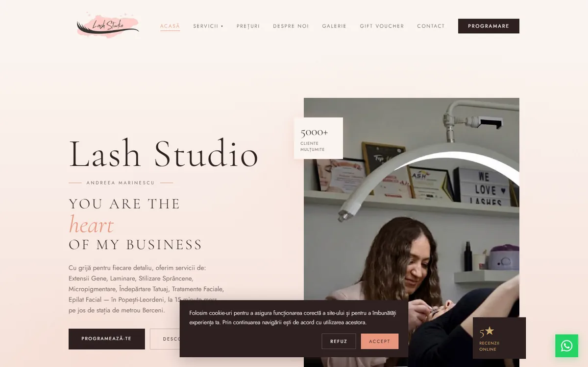
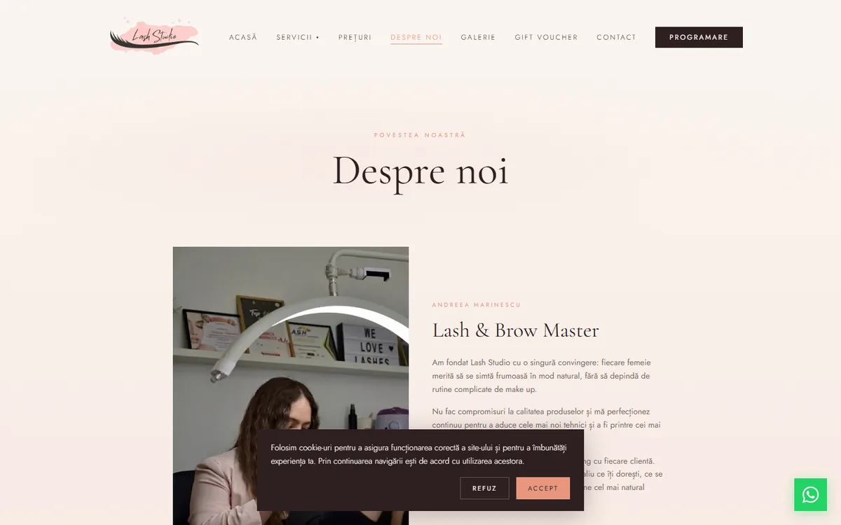
Andreea Marinescu — 5000+ clients, low online visibility.
Lash & brow master since 2016. Own salon in Popești-Leordeni, over 5000 clients, premium products on every procedure (InLei, Tabya, Neicha, RefectoCil), consistent reviews. Online was a different story: active Instagram, but an old site that barely ranked for organic searches.
Before I wrote any code, I set three objectives:
- A fast website on mobile, because that's where beauty decisions happen
- Visibility in Google's top results for local searches like "lash extensions popești leordeni" or "lip micropigmentation ilfov"
- A short path from first visit to booking: phone, WhatsApp, or email, in two clicks max
Why not WordPress.
I ruled out WordPress from the start. Not because WordPress is bad — it's a mature platform. But the multiple plugins, overloaded database, and overhead from Romanian beauty themes make performance nearly impossible without ongoing tuning work. For a presentation site with simple booking, there are cleaner options.
The stack I picked:
- Next.js 16 with App Router: server-side components, built-in image optimization, ISR for frequently updated pages
- Tailwind CSS 4: no config file, palette directly in
globals.css, zero runtime overhead - Neon Postgres: bookings and client database
- Vercel: hosting and global CDN
- NameHero: email on a custom domain ([email protected])
- NextAuth: admin authentication
With this stack, Best Practices and SEO hit 100 on the first deploy. Performance and Accessibility took extra work.
Images, fonts, CSS effects.
Images
Beauty means lots of pictures. If you don't optimize them, you ship megabytes per page and your mobile score collapses. How I solved it:
- All images go through Next.js
<Image>. It serves AVIF or WebP automatically based on the browser, with lazy loading on by default. - For new portfolio photos, I convert manually to WebP with
sharpat quality 82. A 400KB JPEG ends up at 80–150KB with no visible difference. - The homepage hero has
priorityset — preload +fetchPriority="high"for LCP. - The
sizesattribute is explicit on every image. I don't ship 2048px when I need 400px.
Fonts
Initially I loaded Cormorant Garamond and Jost with every weight (300, 400, 500, 600) plus italics. 11 font files per page load. Render blocking close to one second. I trimmed to 6 variants. PSI gained 5 points just from that.
CSS effects on mobile
The hero has a subtle radial blur in the background — a "watercolor" effect. On desktop, filter: blur(40px) looks fine. On mid-range phones, the GPU struggles and paint lags. I dropped it to 24px only on mobile via a media query. Visual difference is small, Time to Interactive dropped almost half a second.
Lighthouse results
After the optimizations, mobile scores:
| Metric | Score |
|---|---|
| Performance | 91 |
| Accessibility | 96 |
| Best Practices | 100 |
| SEO | 100 |
LCP dropped from 3.4s to 2.6s. FCP from 2.2s to 1.4s. Page weight on the homepage from 850KB to 420KB. The design stayed unchanged.
What matters now in a local niche.
Structured data
Schema.org JSON-LD is how Google and the new AI engines (ChatGPT Search, Perplexity, AI Overviews) understand what your site does. Without it, you're silent to these systems — you might show up, but no one cites you in AI answers.
Lashstudio has several schema layers:
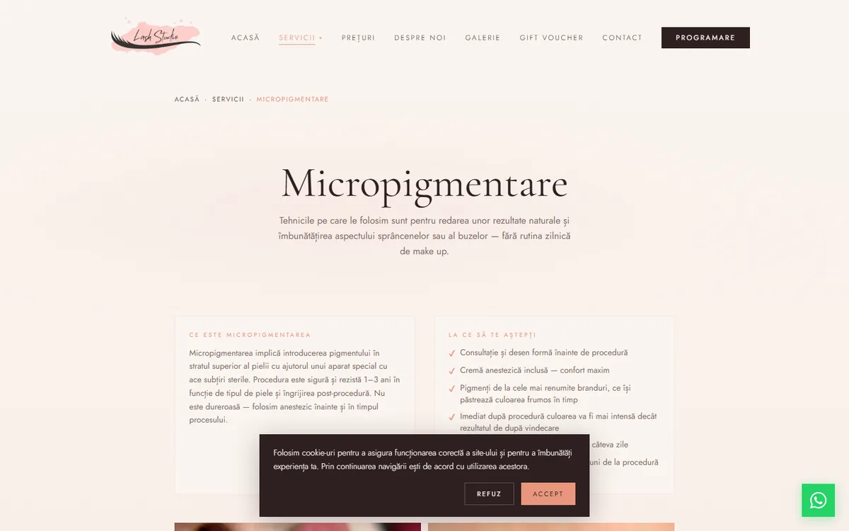
- BeautySalon schema globally in the root layout: full address, phone, email, hours, social media, geo coordinates
- Service schema on each service page: price, duration, description, offers
- FAQPage schema: 9–10 questions per service with answers formatted properly
- BreadcrumbList for hierarchical navigation
Long-tail keywords
On "micropigmentation" alone, you can't win. There you compete with every aesthetic clinic in the country plus portals like Treatwell and Booksy. I went after queries with specific intent:
- "how to take care of lash extensions"
- "lip micropigmentation contraindications"
- "how long does carbon peel take to heal"
- "can I get brow shaping after botox"
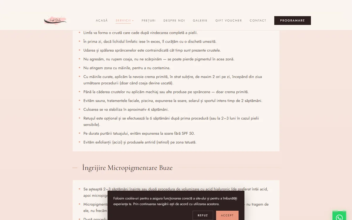
For each service I identified 10–15 such questions — partly from People Also Ask, partly from what Andreea hears from clients at every appointment. The answers show up in two places: on the page as info boxes ("Care rules", "Contraindications", "Pre-procedure prep"). And in FAQ schema, so they can be cited in featured snippets or AI answers.
NAP consistency
Name, address, phone must be identical everywhere. On the site, in JSON-LD schema, on Google Business Profile, in local directories. Google uses this as a trust signal. A comma added, a digit flipped, or an address shortened in one spot weakens local ranking. I centralized the data in one place in code and check manually wherever it appears.
Dynamic sitemap
app/sitemap.ts automatically generates sitemap.xml with all URLs, priorities, and changeFrequency per page type. Adding a new page lands in the sitemap with no extra code.
Design + UX for conversion.
CTAs in the right places
Every page has at least two CTAs visible without scrolling: a primary booking button (dark #2d2020 on cream background) and a contextual secondary one (prices, contact, relevant link). The user always has a path to action, no matter where they entered the site.
Floating WhatsApp button
WhatsApp brand green (#25d366), fixed bottom-right on every public page. On mobile it's the most accessible contact path: one tap opens the chat with the salon. WhatsApp conversion is high in beauty because people prefer quick conversation over an 8-field form.
Gift voucher
The /voucher page has outsized weight in conversion. Beauty is seasonal: Christmas, Valentine's, Mărțișor, Mother's Day, birthdays. Voucher gifts generate new clients at low acquisition cost, and most of them turn into recurring clients.
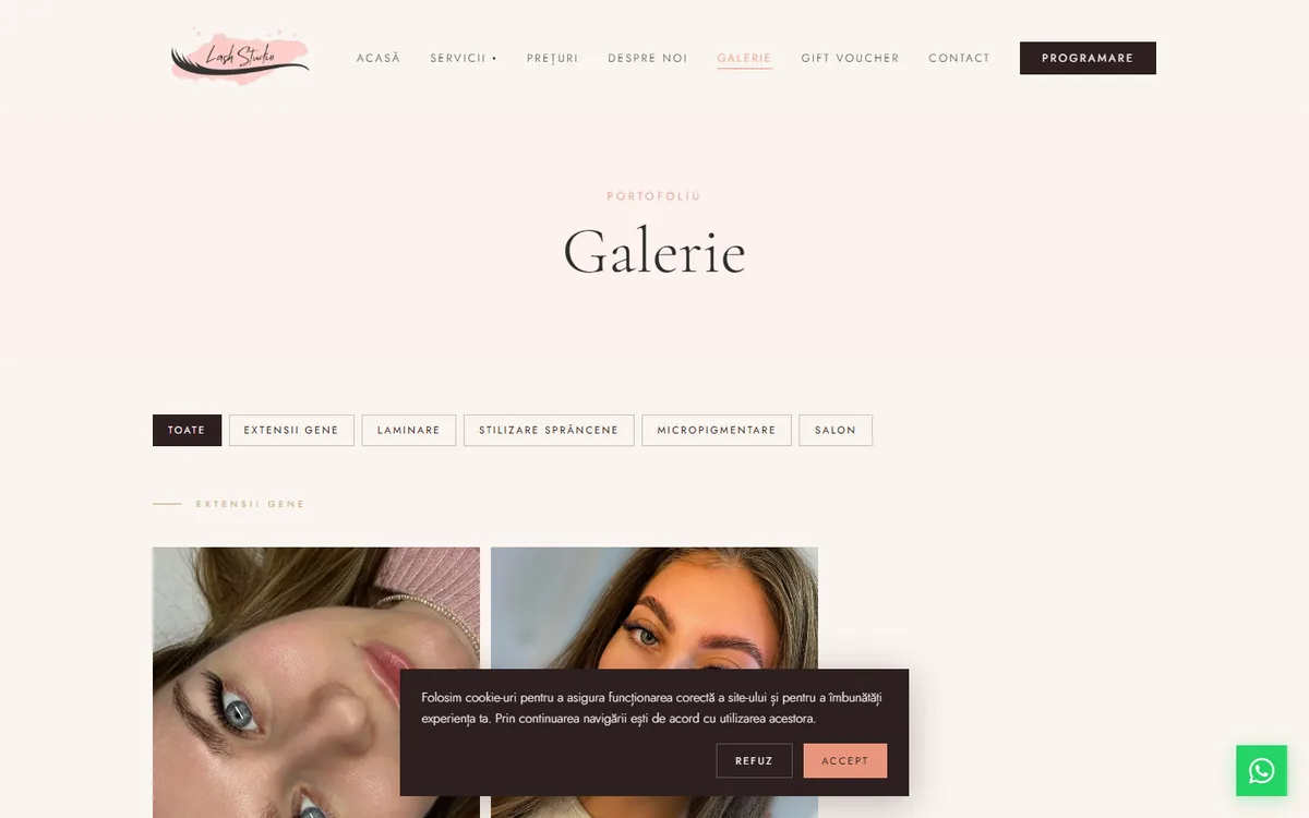
Gallery lightbox
Clicking any photo opens a fullscreen overlay. Esc, click on backdrop, or X closes it. Vanilla with React Context, no libraries: 50 lines of code, zero new dependencies in the bundle. Seems like a small detail. In practice, time spent in the gallery went up noticeably. People want to see the work in detail before booking.
WCAG 2.1 AA, where it shows in the code.
A few practical details:
- The closed mobile menu gets the
inertattribute viauseEffect. Links disappear from tab order, and keyboard users don't hit invisible elements. - Skip link "Skip to content" — focusable, visually hidden, appears only on Tab.
- All text meets 4.5:1 contrast minimum. The
/60or/50opacities on text I replaced with solid colors from the palette. - Explicit focus visible on all buttons and links, with a colored ring.
- ARIA labels on icons,
aria-hiddenon decorative elements.
Final score: 96. To hit 100, a few small accent-colored texts would need revisiting. Below I explain why I chose to stay at 96.
What I found at the competition.
Before the build, I analyzed ~20 salons in Bucharest + Ilfov on similar services. Repeated patterns:
- Most use WordPress with generic themes, no image optimization. Lighthouse Performance under 50 in many cases.
- Less than half have complete JSON-LD schema. The rest either don't have it, or have errors that make Google ignore it.
- Very few have structured FAQ on service pages. They miss all the long-tail traffic.
- Many don't have a complete Google Business Profile: missing address, no hours, no photos, no review replies.
- Cookie and GDPR policies — frequently incomplete or absent.
For a new salon: a site built technically well can rank in the local top 3 organic with no large paid ad budget. That was the initial thesis. The data below confirms it works.
What didn't work — three reverts.
After the first week live, I came back for a round of targeted optimizations. PageSpeed Insights flagged a few issues: render blocking 900ms, forced reflow 348ms, unused JS 29 KiB.
I tried 6 things. Three worked, three didn't. I'm sharing all of them, because "what doesn't work" is as useful as "what works."
What worked
1. Resize logo from 5000×2092 to 600×251 — the logo delivered by the client was 5000px wide, 306 KB. On the site it displayed at max 80 CSS pixels. So I was shipping an image 13× larger than needed. Resize with sharp to 600×251, quality 90, output WebP: down to 26 KB. Direct win: −280 KB on every first load, no visible difference at all.
2. Scroll listener with requestAnimationFrame — the nav shortened in height when the user scrolled past 40px. The handler read window.scrollY and set state directly. PSI flagged "forced reflow 348ms". The fix: throttle with requestAnimationFrame and setState only when the value actually changes. Plus I shortened the CSS transition from 500ms to 300ms. Forced reflow turned green.
3. Hero image with blur placeholder — Next.js <Image> supports placeholder="blur" with blurDataURL. I generated a tiny base64 (10×10px blurred) for the hero. The user sees something painted on screen instantly, before the real image downloads. Perceived performance ↑ even without a real LCP improvement.
What didn't work
4. experimental.optimizeCss: true — on paper sounds perfect: extract critical CSS, inline it, defer the rest. Real result: Performance dropped from 91 to 89. Forced reflow came back. The experimental flag really is experimental. Rollback in 2 seconds. Lesson: test experimental flags in isolation, not in production on real traffic.
5. Dynamic import for CookieConsent and GoogleAnalytics — I wanted to pull both client-side components out of the initial bundle via next/dynamic. Logically, they're non-critical. Result: Performance dropped from 91 to 87. For components this small (under 3 KB each), the overhead of a separate runtime fetch is bigger than the bundle-splitting win. Lesson: code splitting makes sense for large or rarely-used components, not for things that show up on first paint.
6. Changing the accent color for Accessibility 100 — the most painful decision. PSI flagged contrast fail on #e8967e (pink-coral) used as text on cream background. For a perfect 100, it'd need to switch to a darker variant (#a4502f, rust). 115 replacements across 19 files. I made the change, then reverted it. The accent went rusty, the palette lost its "warm coral" feel that was part of the salon's visual identity. The 4-point Accessibility gain didn't justify the palette change on visible text. The salon chose to stay at 96 with the original palette. 96 is still industry-leading.
What I learned from this round
Two practical things that stick with me:
First: not every "best practice" recommended by PSI applies universally. Experimental flags and dynamic imports for small chunks can have the opposite effect. Measure after each change. Don't assume the direction is right just because the docs say so.
Second: there's a point beyond which technical optimizations stop bringing real user gain. The difference between 91 and 95 on PSI doesn't show in actual behavior. The next gains come from new content, backlinks, conversion — not from one more kilobyte cut from a shared chunk.
Mobile, tested on real devices.
Over 80% of beauty salon traffic comes from mobile. If the site doesn't work decently on mid-range phones (older iPhones, Samsung A-series, Android under €300), you lose conversion before anyone reads anything.
I tested constantly on 3 real devices: iPhone 11, Samsung A52, Xiaomi Redmi Note 10. Not just Chrome DevTools simulator. It surfaced issues the emulator doesn't see: GPU lag on blurs, touch targets too small, scroll lag on the gallery with many images.
Lessons I take with me.
- WordPress isn't the best choice for small salons if you want real performance. Cost-benefit is weak vs modern alternatives.
- JSON-LD schema is the most underrated SEO optimization. Two hours of work, measurable benefits for months.
- Extended FAQ on the service page works better than a separate blog for long-tail searches. Plus Google cites it more often in featured snippets.
- JPEG → WebP saves 50–80% on image size with no visible loss. For a beauty site with dozens of photos, that's megabytes per load.
- Don't add libraries for simple things. A working lightbox in React is 50 lines with Context. A 30KB library for the same result is overkill.
Full tech stack.
- Frontend: Next.js 16, React 19, TypeScript, Tailwind CSS 4
- Backend: Next.js API Routes, NextAuth for admin authentication
- Database: Neon Postgres (serverless)
- Hosting: Vercel with global edge CDN
- Business email: NameHero ([email protected])
- DNS: Vercel
- Monitoring: Google Search Console + Vercel Analytics
Want something similar?
If you want a site that performs — not just looks good — and brings clients organically through Google, not just through paid ads, write me. On the first call we discuss concrete scope and recovery math.
Apply for a call →Live site: www.lashstudio.ro